Intuitive Search Specs
Users of today’s internet have high expectations when it comes to search. They’ve grown to expect certain search patterns and functions, such as autocomplete, in all of their search encounters, thanks to Google and other sites. Autocomplete, also known as predictive search, is critical because it directs users to more relevant search results, hence improving the user experience. In this post, we’ll define autocomplete, discuss its advantages, and offer some recommendations for using it in your search.
Autocomplete is a search function in which the search engine anticipates the user’s query and suggests alternatives as to the user inputs. Without having to manually type every character, the user can select any of the autocomplete recommendations and be taken to the results.
Autocomplete and predictive search, also known as autosuggest, query recommendations, and search-as-you-type, are critical for increasing retention and conversions. This is partly owing to the fact that they help consumers find relevant results faster, lowering bounce rates caused by issues like user confusion, distraction, or the inability to identify products and etc. Many web design services providers have adopted this and they include this feature in almost all of their projects.
How these search features can help the user?
1. Offers successful queries
Autocomplete suggestions, when properly adjusted, always lead to results reducing the odds of a no results page. You can increase the chances of a user sticking on the site and engaging with more material by offering them some common queries that are guaranteed to return relevant results.
2. Educating the users about your site

Users may not be aware of the full scope of your services. To increase user awareness of your site, autocomplete might provide product and content categories that fit with company aims.
3. Decreases search time
Users rarely have to input their whole question since autocomplete offers relevant alternatives rapidly. This can save consumers time by preventing them from inputting long, complex queries and typos that some search engines could struggle to understand. Autocomplete can help users avoid mistakes and get relevant results faster, reducing the chances of a failed search.
If you are a web design company that is seeking to establish a strong customer base, your work should be unique and attractive. The above-mentioned features will definitely help you achieve that goal by making search specs in your website more intuitive.
What functions should your intuitive search provide to the user?
As a web design company, you should focus on delivering quality products to your customers.
Give Immediate Outcomes
Autocomplete suggestions must appear practically instantly when the user begins typing, with no lag time. Quickly given suggestions also improve the overall user experience by making the interface feel more engaging and conversational.
Highlighting The Inconsistencies
Use highlighting or bolding to make distinctions between suggestions shine out to your users so that they can quickly read and discern between them.
Make Your Suggestions More Effective
The suggestions from autocomplete are only useful if they are relevant. Company relevance, data obtained by site search analytics, and business goals should all be considered when making recommendations. An autocomplete search engine that is optimized should be typo-tolerant and employ the same relevancy criteria as your search engine.
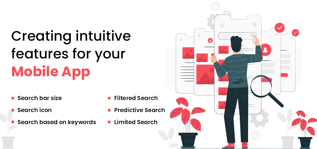
Creating Intuitive Search Features For Your Mobile App

Most users’ initial activity in any app is probably to search. It’s a wormhole that allows users to skip ahead to their preferred location. However, there are significant variations between the search capabilities of a great app and a good one.
- Search Bar Size
The search bar should be large enough, according to the UX search best practices book. If your design allows, the search field should ideally be a large box that the user can see. You’ll frequently come across search icons, which when clicked expand the search field. Though it appears to be engaging, it has bad results from a UX standpoint, and hence it should be avoided.
- Search Icon
A magnifying glass should always be used to depict the search field. People have grown to accept the indication by default as a result of all the snitch movies that used clichéd magnifying glasses to look for anything. Use the most basic image of a magnifying glass with minimal graphical embellishments. This is one of those places where the less you do, the better it gets.
- Search-Based On Keywords
There’s nothing extravagant about it. You type your search phrase into the search area, and a list of search results that match your terms will get displayed. Simply select the one that is closest to the information you require, and you’re done. This method is still used by a number of apps. For example, Twitter displays both the hashtags and, if applicable, the social handles linked with your query.
- Filtered Search
Websites with tens of thousands of products use heavy-handed filtered search to provide a more refined search experience in the app. Domains such as e-commerce, education technology, and travel are examples. Given the thousands of results that match the entered term, it is prudent to allow a user to focus on the possibilities that are most closely linked to their search.
- Predictive Search
Incorporating an auto-complete option is a fantastic idea for apps that require a lot of data entry, such as conversational apps (like WhatsApp) or lifestyle applications (like Pinterest). One method AI can assist in the development of next-generation apps is through this functionality. In-app capabilities that register recent searches as part of the search history must be built by the app design company that develops your application. When re-entering a term, the user’s recently entered keywords will appear first in the auto-suggest drop-down list.
- Limited Search
Adding a variety of sophistication to your app may not always be the best option. In order to maximize page visits, websites aim to extend user sessions. An app defies this trend by focusing on the user’s return visits, even if they are only a few seconds long. Limiting search features in an app could be considered based on design concerns. Keep only what is necessary to take the customers where they want to go by using tactics such as categorizing the materials.
Suggested: Top 10 Tips for Effective Web Design and Development
Final note
While autocomplete is an important part of a site’s search, fine-tuning the relevancy for your users can be challenging. AnyAlpha, a custom software solutions provider, can give you the search UI, analytics, and other tools you need to make the best search possible. Customer is the most valuable asset any business has. This applies to web design services as well. Attracting new customers and improving existing relationships can be done by giving users what they need. Intuitive search specs are for sure, a great way of achieving this goal.

Director @Anyalpha, a Top Software Development Company offering Mobile App Development and Website Development Services to Businesses & Startups.


